Ready to Tickle Tickle
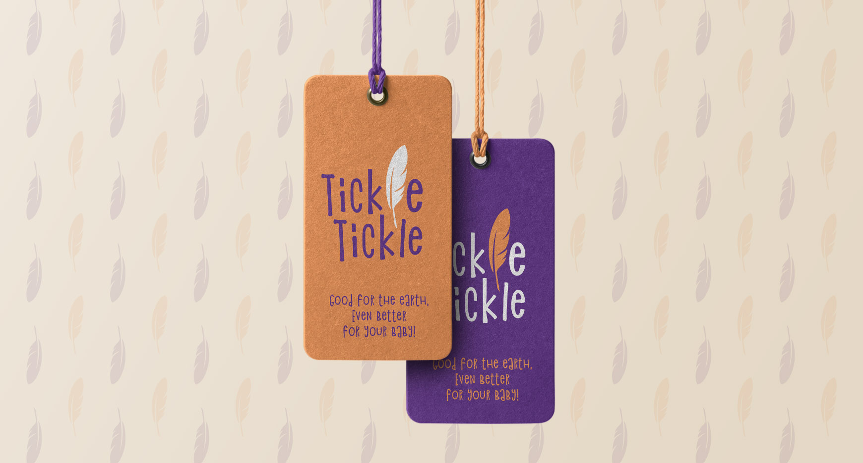
Brand Identity for a new organic cotton, sustainable clothing for kids.
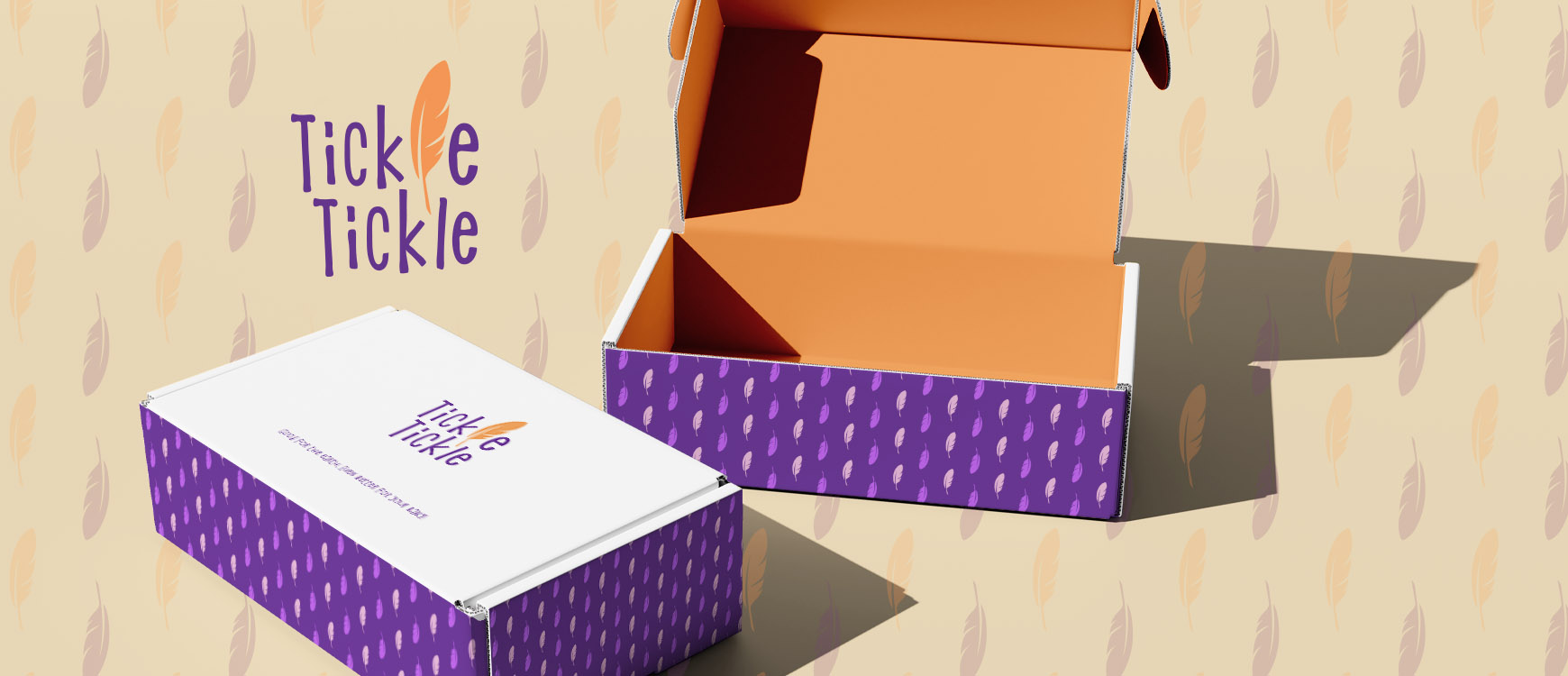
Tickle Tickle started by a mom’s mission to find something nature loving, organic, comfortable and far away from fast fashion for her child. Her vision about the brand was to have something playful, something that is approachable by the mums. So the idea for the logo is based on the ticklish aspect of the brand name. A feather is soft, ticklish and light. The floating feather gives the identity the soft feel to the brand.
The typography is fun, the colors are product centric. The inspirations were taken from children writing. The brand colors were inspired from everyday environment of kids. Bright, fresh & attractive.
Launched the brand at the start of 2017. Now a regular at local kids market, the brand i am happy to say is doing well.
