SODIC Properties
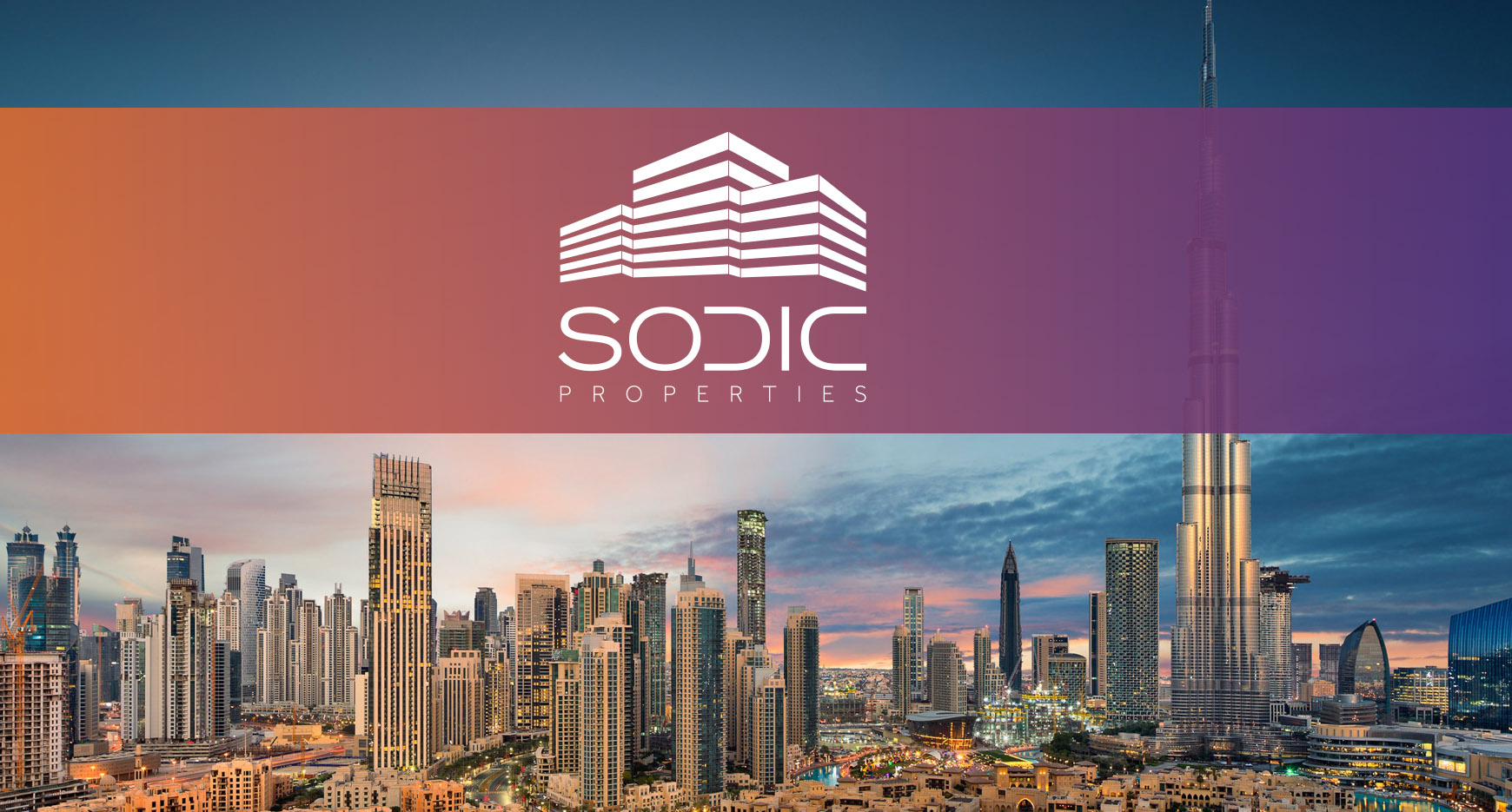
A property developer brand refresh exercise.
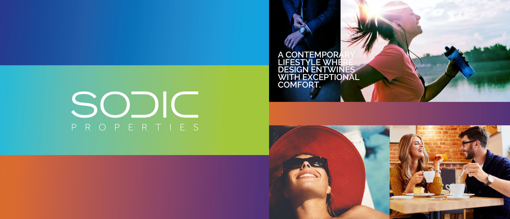
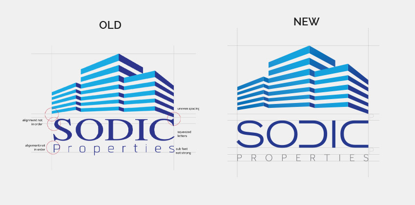
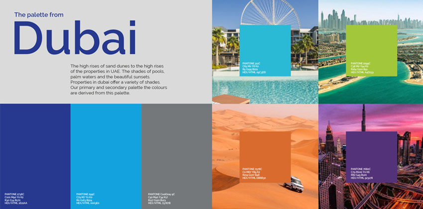
A quick update for a friend, who needed a logo refresh and 3 social media post for her client. Sodic Properties had a logo which had major readability issues. I was told to look over about the issues. And fix the social media presence. The logo now is more simplified, minimal and has strong presence. The colour palette is also revised with brighter and fresher colours. The colours were based on the landscape of dubai. The use of gradient and brighter colour enhanced the social media presence. A quick turn around for pro bono job. Was fun to add a refreshing touch to the brand.
