FOOD & FLOWER CART Brand Refresh
FOOD & FLOWER CART Brand Refresh
Brand Launch / Brand Identity / Logo Design / Communication Design / Social Media Design
Brand Identity Design & Website Design for a London, UK based homegrown market.
Food flower cart started off as a small shop in the community but was with businesses struggling to keep up with the demand was losing out on new consumers. The old brand identity was very corporate. It lacked the fresh & warm approach.
When i started working on the brand. My first step was to revise the brand identity to make it more organic, wholesome and feel fresh every time you see it.
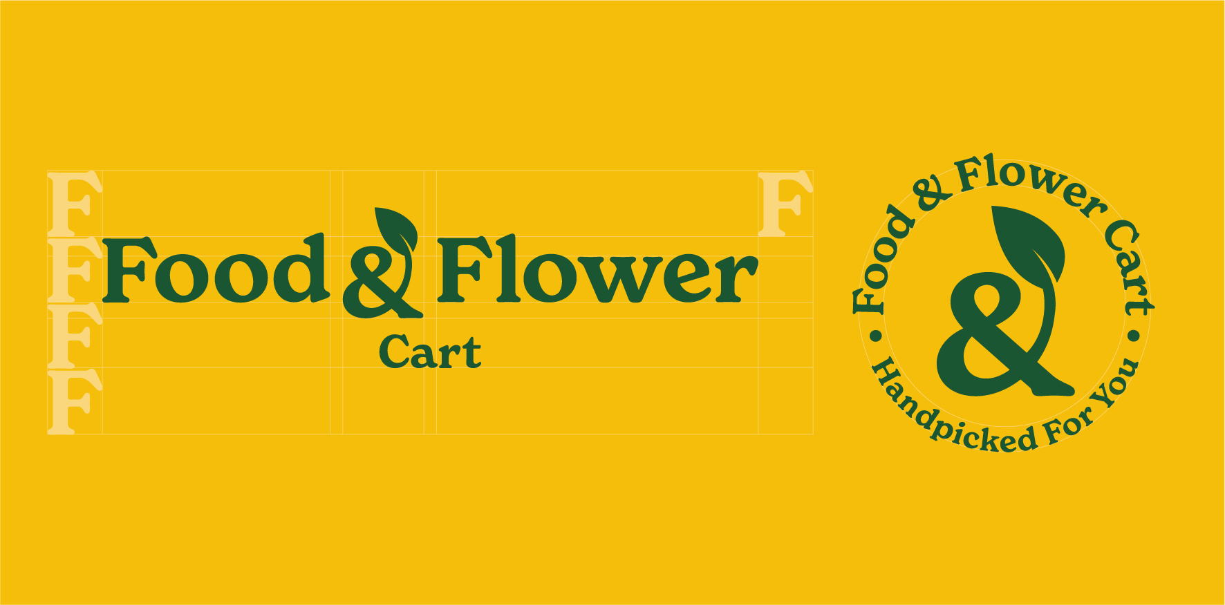
The idea of the ampersand with the leaf is like an addition of things. Coming from the strategy and client brief of making the market a one-stop-shop for healthy organic supplies. Since the client wants to venture into tea, date, jams & dry fruit products line. The “&” keeps on adding elements. The rounded typography gives an organic feel.
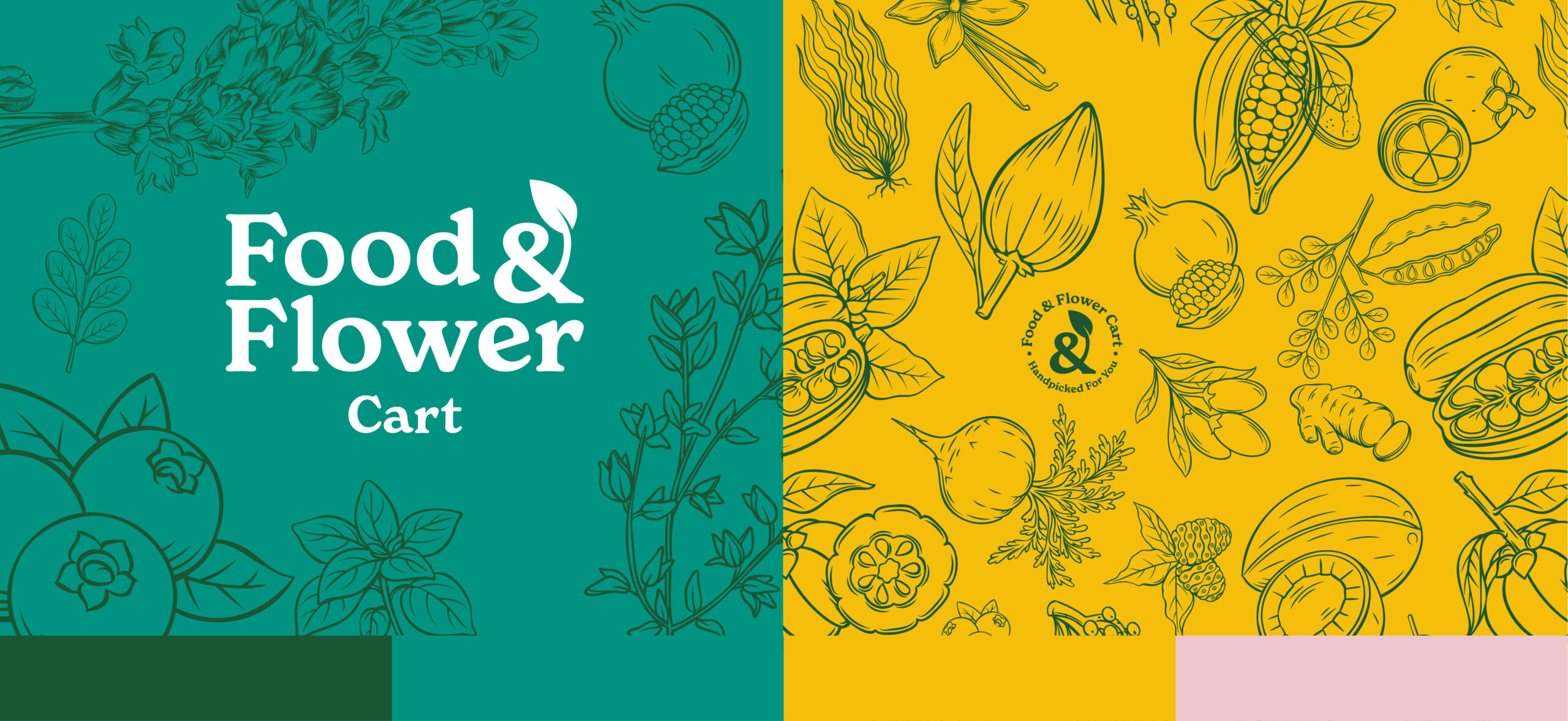
The strategic line “Handpicked for you” works on many levels. Gives a warm personalized feel for the brand. Also in terms of freshness for flowers, veggies and fruits.
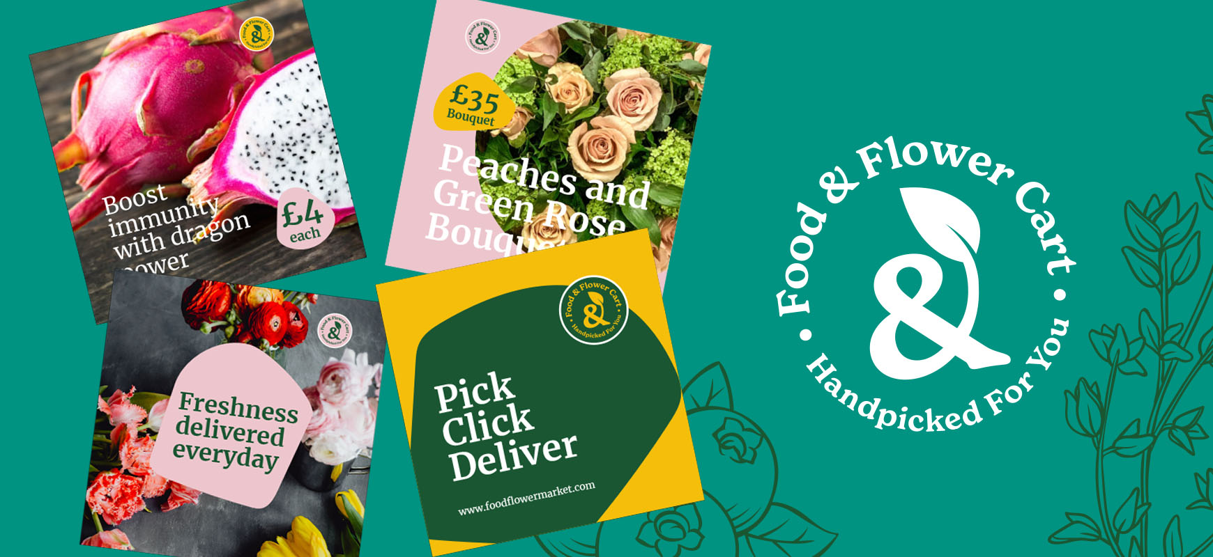
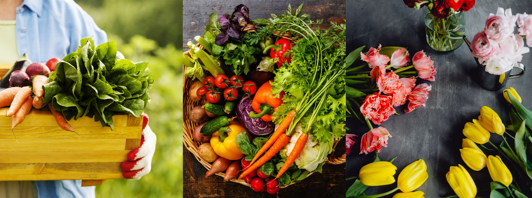
The color palette is fresh yet organic earthy feel. The yellow is vibrant, giving a sense of brightness. The stock graphics of plants and flowers gives a sense of healthy organic produce. The eco-friendly brand identity which resonates with the community. Even the social media template design is based on the organic shapes of fruits and vegetables. Giving a unique look and feel for the brand.
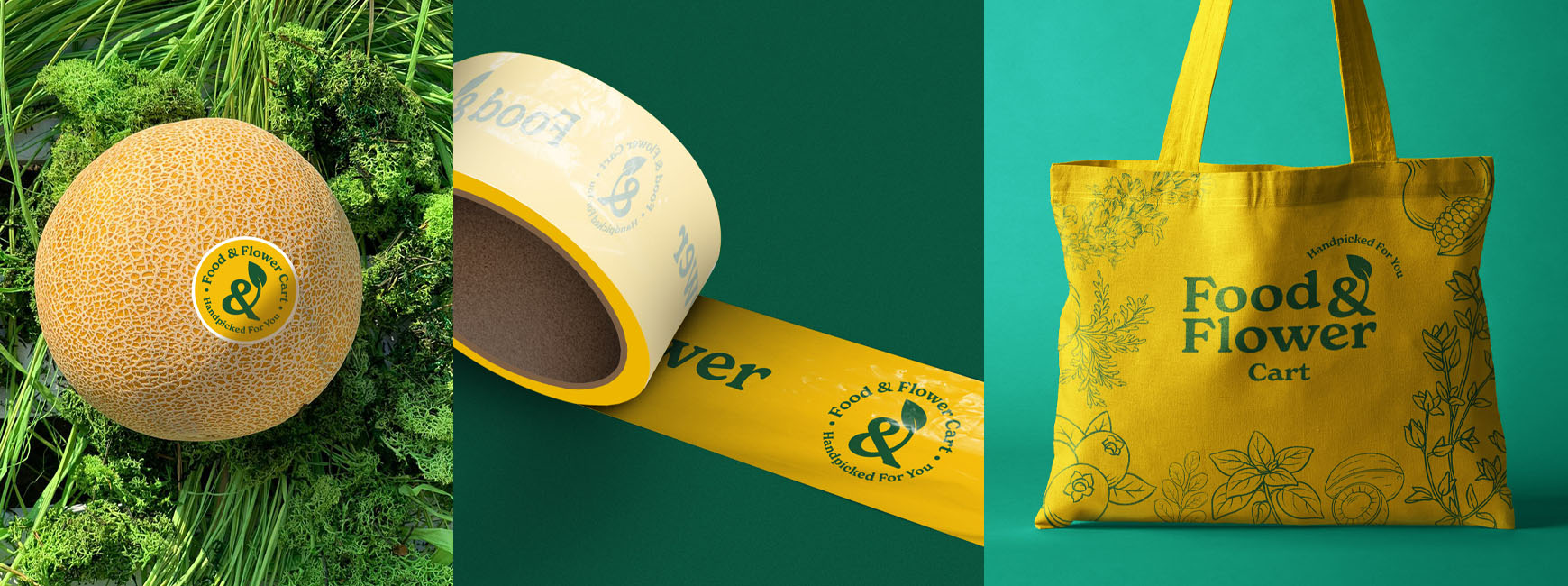
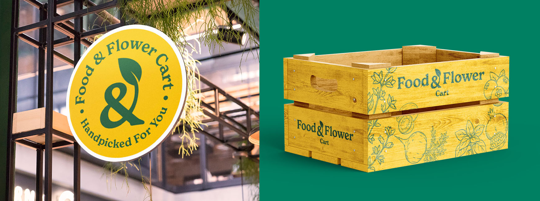
The results after the branding and social media push has been steady. Because of UK going in & out of lockdown. But the brand has now ventured into tea, jams and other fresh food items apart from fruits, vegetables and flowers delivery.
